Crafting brand identities takes time and thoughtful consideration.
From both in-house and freelance experience, I’ve seen how branding is far more than visual decoration—it’s strategic storytelling. A strong logo and cohesive visual system serve as entry points, but true branding shapes how audiences feel, interact, and remember an organization. I focus on designing identities that are not only striking and timeless, but that build trust and distinction across every touchpoint.
Whether refreshing a legacy brand or launching something new, my process always begins with deep research—uncovering what makes the brand tick and what sets it apart. From there, I develop tailored design briefs that align messaging with aesthetic clarity. The goal? To craft visual identities that resonate, adapt, and elevate—from the logo to the style guide to every pixel in between.

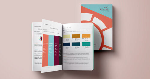

As an in-house graphic designer for Arizona Community Foundation, I was invited to lead the logo redesign for the Planned Giving Roundtable—an initiative backed by a diverse committee of stakeholders, each with a vested interest in how the identity evolved. We began with a collaborative discovery process, conducting multiple rounds of dialogue to align vision, values, and expectations before diving into design.
Guided by research and strategic insight, I presented refined concepts that offered clarity, flexibility, and resonance. Their final selection wasn’t just a refreshed logo—it was the foundation of a cohesive brand system. I extended the identity with a new color palette and visual framework that brought consistency and energy to their communications. The result: a distinct, modern brand presence that empowers their ongoing mission and elevates their visibility in the philanthropic space.
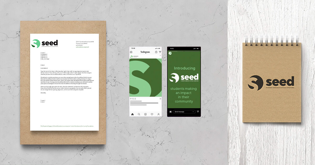
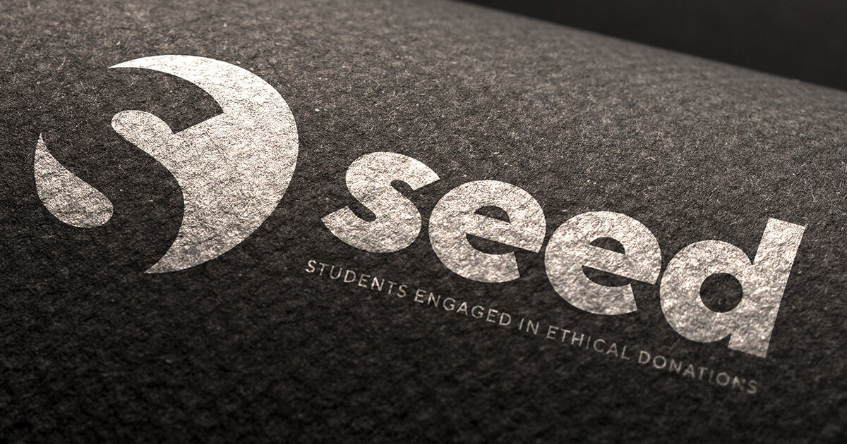
I was tapped to develop the logo and full visual identity for Students Engaged In Ethical Donations (SEED)—a youth-centered initiative focused on cultivating responsible giving. Recognizing the importance of connecting with a younger audience, I approached the project with a strategy rooted in clarity, approachability, and impact.
Beyond delivering a clean, memorable logo, I built a versatile brand system that spanned print materials, digital touch points, and a vibrant social media framework. I placed special emphasis on ensuring SEED’s online presence reflected their values—designing assets that were not only on-brand, but also engaging and easy for their internal team to implement across platforms. The result was a cohesive visual language that empowered SEED to build awareness, spark dialogue, and inspire ethical action among students.
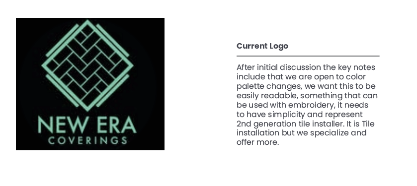
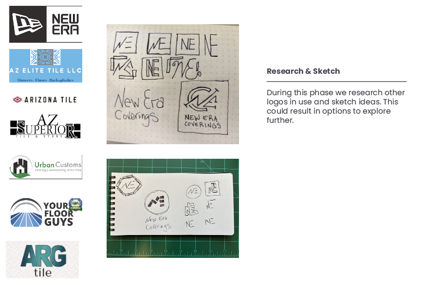
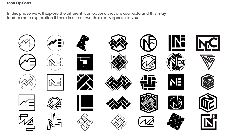
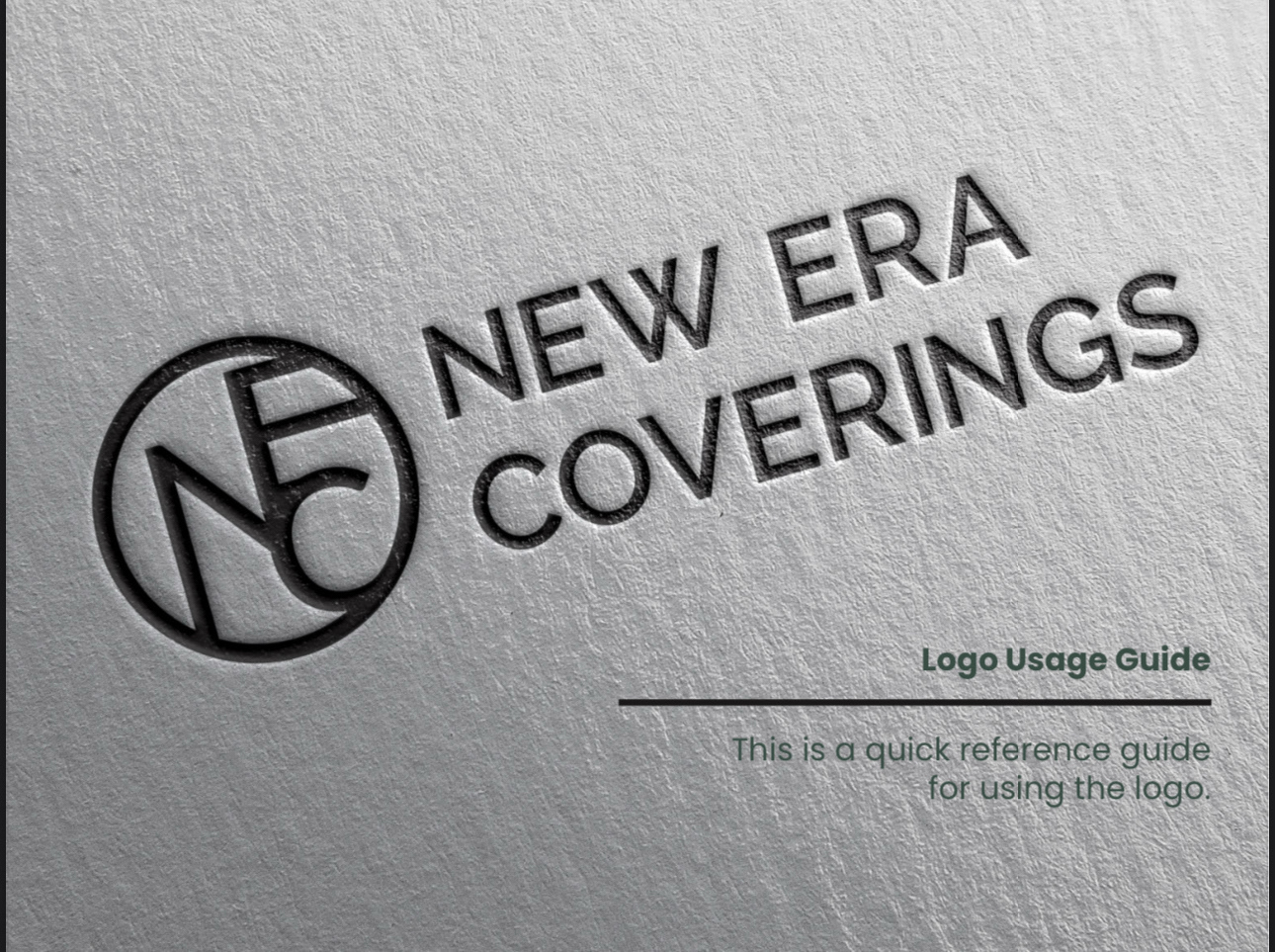
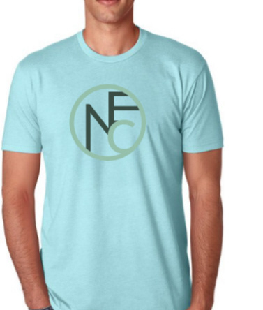
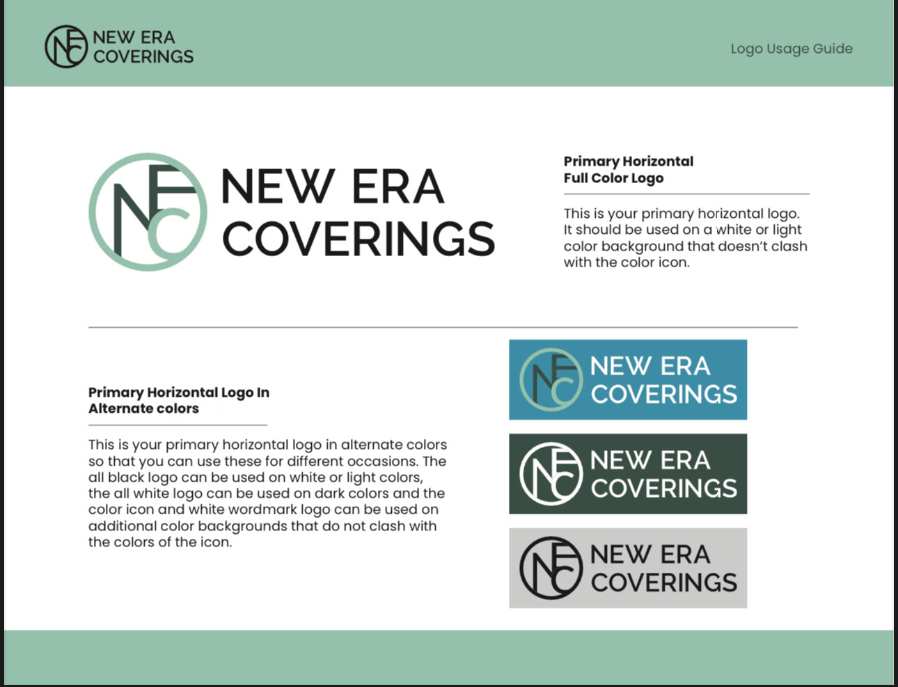
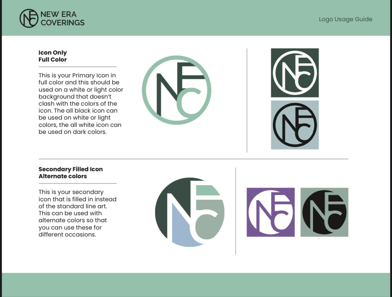
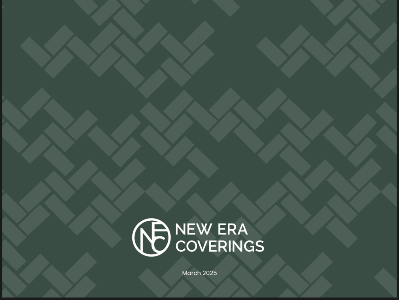
New Era Coverings Case Study
Partnering with small businesses like New Era Coverings is always a rewarding creative experience. When the owner discovered my work through social media, he reached out with a clear ask: a refreshed logo that could breathe new life into the brand he’d been using for years. I welcomed the challenge with a strategic approach—diving into research, exploring design directions (even sketching ideas during a layover in Denver), and crafting a fresh identity that truly reflected the personality and grit of his business.
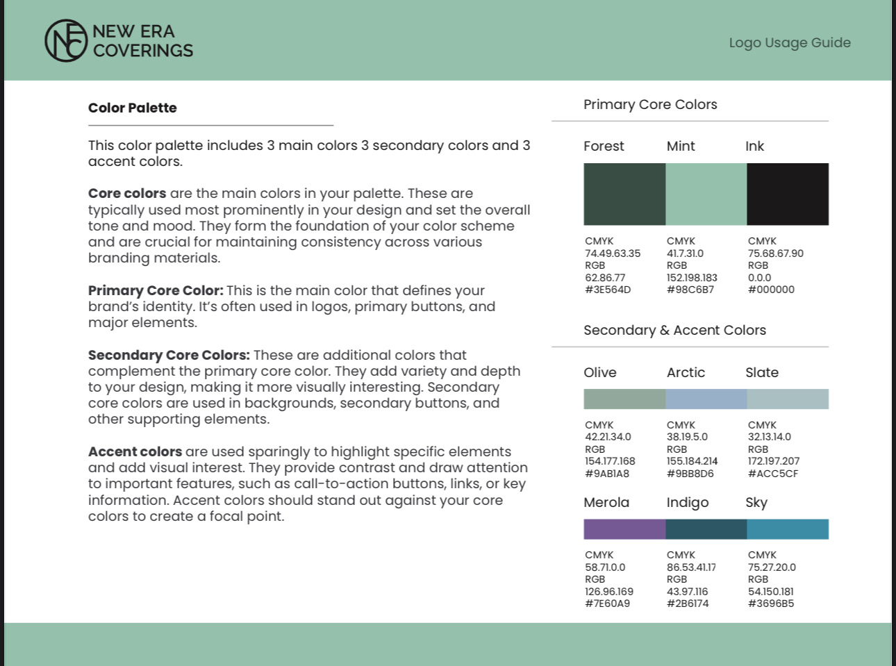
The final result was more than a logo—it was a bold, cohesive brand system tailored for growth. From typography to color palette, everything was designed to give New Era Coverings a standout look while staying true to their story. Check out the case study below to see how it all came together.
Logo design has always been one of my favorite creative outlets—where storytelling meets simplicity. My love for branding started with a hand-drawn logo I created for ACCESS Hip Hop, an underground store in Southern California. I entered it into a design contest, and it won. That early win sparked a passion for crafting logos that are not only distinctive, but rooted in meaning and culture.
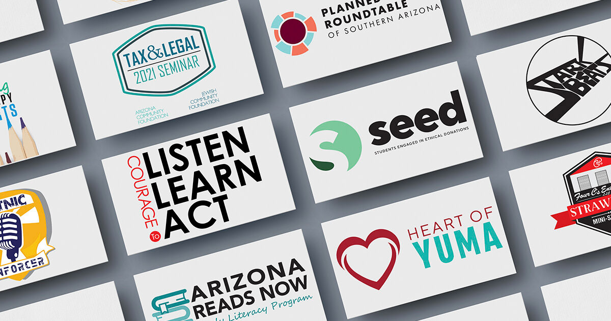
Since then, I've had the opportunity to create identities across industries, each with its own voice and personality. Here are a few highlights from my branding journey—each logo designed to turn heads, build trust, and leave a lasting impression.
Crafting full visual identities is where the real magic happens. It’s not just about a great logo, a color palette, or a killer typeface—it’s about building a brand that moves, breathes, and connects. This is where art direction gets to stretch its legs and creative freedom truly gets to dance.
Here are just a few identity systems I’ve had the pleasure of bringing to life—each one designed to do more than look good, but tell a story that sticks.